UPDATE!
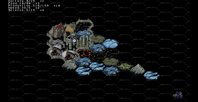
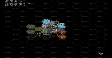
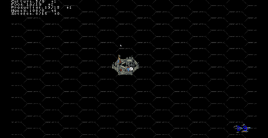
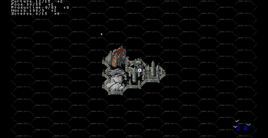
Finally, I've had the chance to work on the game again. Although I haven't had time to focus on the graphics yet, I've made some changes to make resource collection more visually apparent. I've also added small hints at the bottom of the screen regarding the tile the player is hovering over. Additionally, I tweaked the game balance and fixed some mechanics that weren't working correctly.
In the next update, I plan to add a user interface and implement a mechanic for combining tiles into unique formations. It will be something similar to the natural wonders from "Civilization VI" and crafting from "Minecraft." By arranging specific tiles in a certain way, they will merge into a mega-tile with unique properties.
Files
CityTiles
Shape your city's destiny by placing tiles. Left-click to build, right-click to discard. Expand wisely, grow strong!

Comments
Log in with itch.io to leave a comment.
super awesome!
already much more playable.
tbh i forgot about this for a while and just remembered to check and wow perfect timing you just updated!
it's nice to not have to stress about inevitably getting a bunch of unnecessary resource-suck buildings anymore, though i haven't figured out yet how to get them again - haven't done a longer run yet.
also awesome to be able to put improvements on tiles that have been claimed.
super excited for that mega tile thing, that's such a cool idea!
also you said no graphics update but the walls look so much better tucked behind larger items <3
i also have a small criticism if you are interested: i dislike the way the resource icons float to the top corner and would prefer if instead they did something like float upwards a bit and fade away.
thank you for updating, looking forward to more!!
Thank you so much, I'm glad you were looking forward to this update, haha! Buildings start appearing when the production reaches a sufficient level. There's a system that prioritizes which building will be constructed, but with the current balance, it’s mostly houses that increase the population cap for the city.
The ability to make improvements was available before; I just added highlighting for tiles that can be upgraded to make it clearer. :)
As for the walls, yeah, there was a small bug before because the walls and tiles were on different layers, which made them look off.
The tile combo feature was technically challenging, which is part of why the update took so long. But I think I've found the optimal solution, and now I just need to draw everything out. :)
Regarding the resources icons – that's a great suggestion, thank you! When I add the full interface, I hope to find a more elegant solution, but if not, I'll definitely implement it the way you suggested!
Thank you for staying in touch!